We’ve all been there in marketing. Digging through endless Excel pivot tables and building countless dashboards just to answer a rather simple and straightforward question. Who are our customers and how can we reach them effectively? With just a few lines of code, we can instantly get ACTIONABLE insight on our customers and make strategic decisions already. Here’s an example of how easy it is.
Here we have a sample dataset, and our goal is simple, we want to understand how to increase our conversion rate. With just one line of code in Python, we can make the following graph.
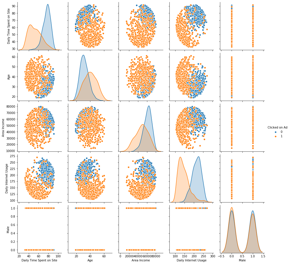
We can instantly see that neither Daily Time Spent on Site, age and area income is not a main factor in who our customers are, but rather their internet usage amount plays a key role in 4-1, 4-2 and 4-3. In our case (which is this random sample dataset that I made up), we need to focus our marketing strategy to target users who don’t spend a lot of time on the internet. This could mean to increase our OOH media spending or sponsorship of live TV events and etc.
The second useful graph is a heatmap, which in this case, helps us visualize how long our customers are staying with us. A very important point when we are making strategic decisions based on CLV.
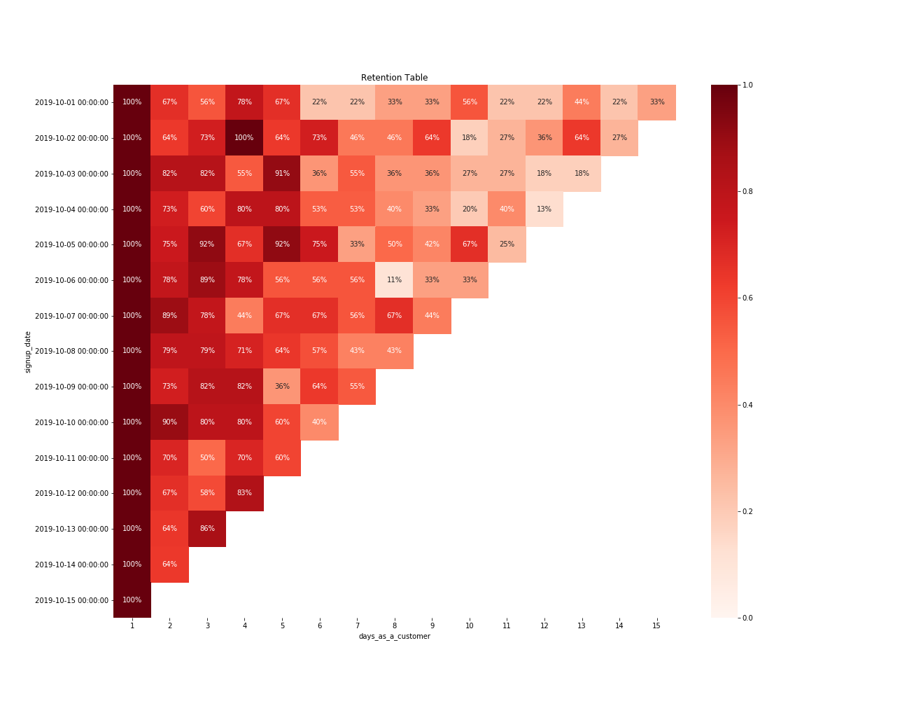
For instance, in this sample dataset, we immediately see two things from this graph. If we are running a specific marketing campaign at a certain time, we can find out if the customers gained in that period have stayed with us for longer or shorter compared to our customers gained in other periods. The second thing is that we can see when we start to lose our customers after a couple of days, so it is time for us to offer potential discounts or send notifications to them after a certain period of time.